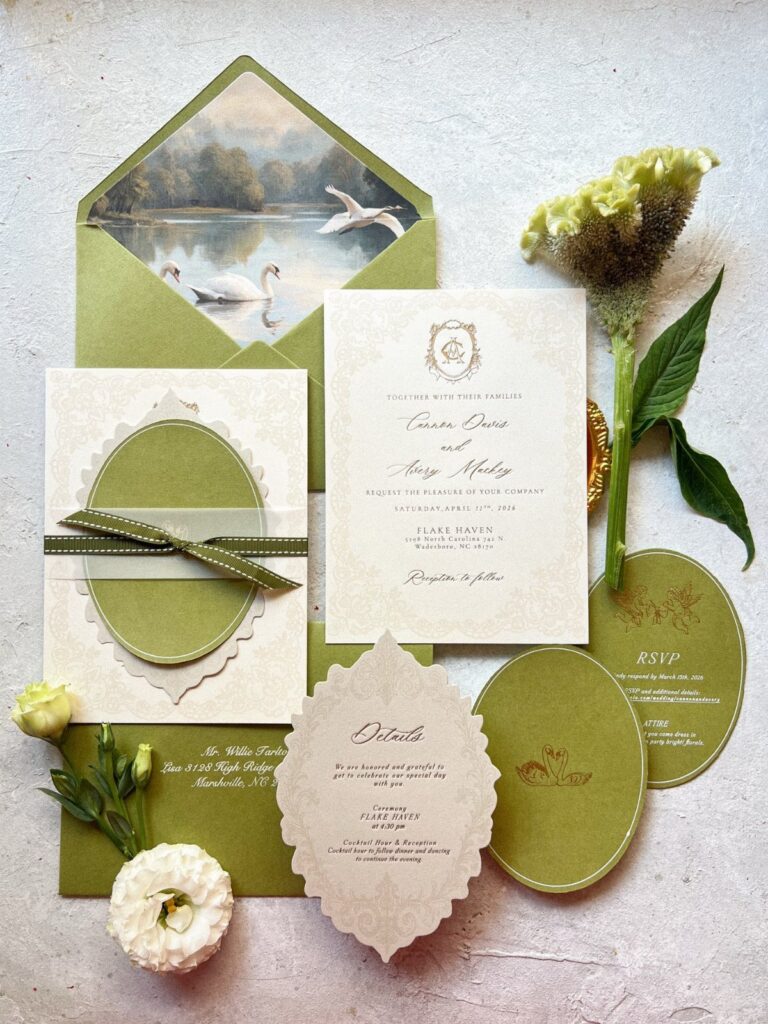
The suites in this post run from a plain invitation with an RSVP card to letterpress, mirrored acrylic or an illustrated venue, so the range is wide.
Guest count and the share of budget you can give to print decide which of these fits, since every added card, layer, seal or ribbon adds printing, assembly and postage.
1. Day-of Stationery Matching the Invitation Suite
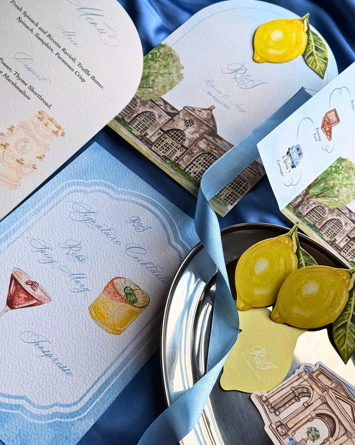
Menus, a signature cocktail sign and place cards can all pick up the same lemon motif and building illustration as the invitation, which makes the reception read as one design instead of a pile of separate print orders.
I would order these in the same run as the invitations. Matching ink and paper are easier to get when one designer handles everything, and a bundled order often costs less than adding pieces later.
Keep the list short on a tight budget. The menu and the cocktail sign carry the most visual weight.
2. Letterpress Invitation
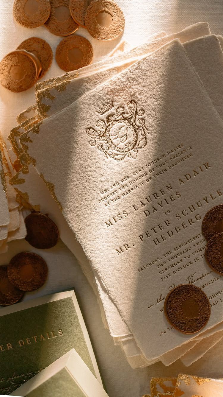
Letterpress presses each letter into thick cotton paper, so the lettering sits slightly below the surface and you can feel it with a fingertip.
It is a splurge, and I would spend on it only if the invitation is the one place you want to go all out.
Pick one or two finishes, not all three. A crest plus a wax seal already says formal.
Order a printed sample first, since the impression depth is what you are paying for.
3. Neutral Tones Invitation Suite
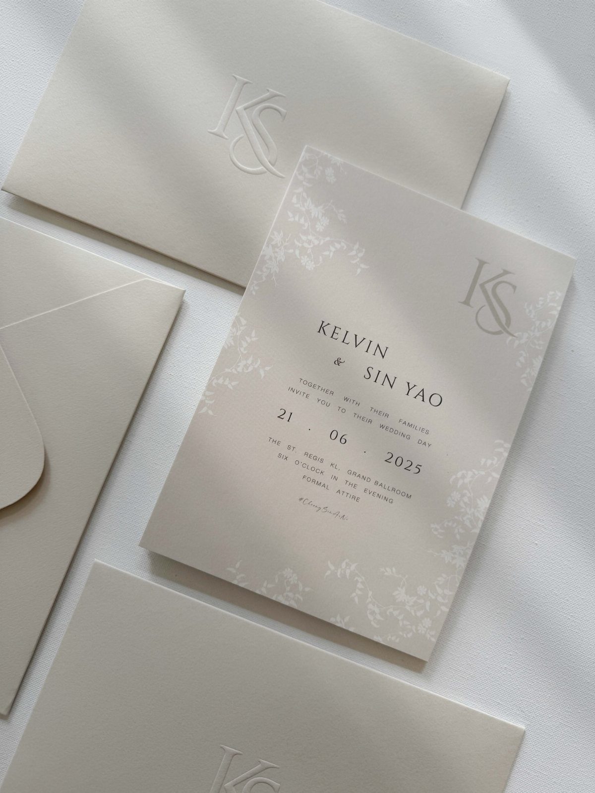
White, cream and black type make a suite that looks calm and costs no more than any other color scheme. Cream cards with matching envelopes and a monogram do the work without extra embellishment.
I like black lettering on cream because it stays easy to read, which older relatives will appreciate. Keep the envelopes in the same family so the set looks intentional.
Neutral also ages well and works for almost any venue. Put your personality in the monogram, not in loud color.
4. Wedding Invitation Suite
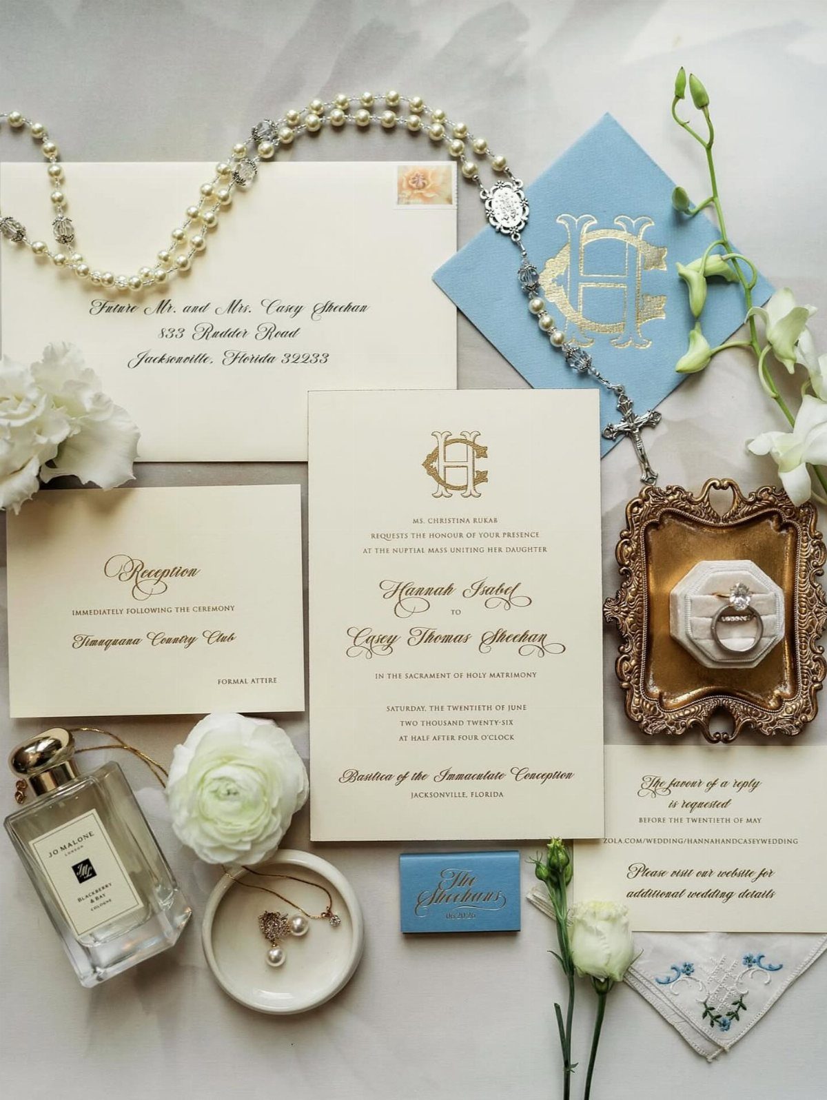
A full suite bundles the invitation, a reception card and an RSVP card, and the pieces belong together in one design.
Buying them as a set is usually simpler than piecing them together, because the fonts, paper and ink match from the start.
Decide early which cards you truly need. Every extra card adds printing and postage.
If the reception is at the same place as the ceremony, I would fold that information into the main invitation and drop the card.
5. RSVP Card
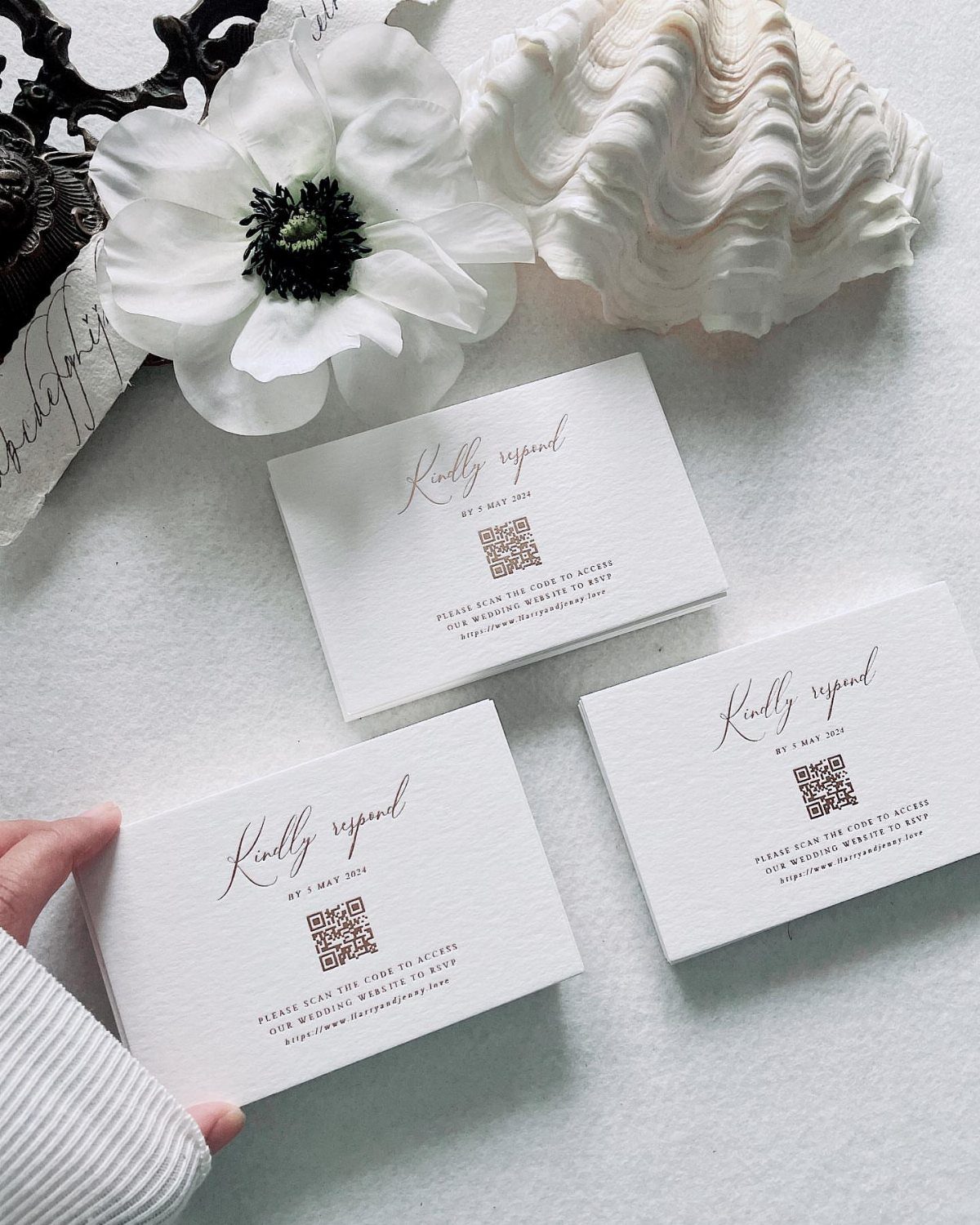
Guests answer faster when the RSVP card is plain about what to do. "Kindly respond" plus a QR code that opens your response page lets them reply from a phone in under a minute.
I would still tuck in a line for people who prefer paper, such as a mailing address, since not every guest will scan. Set a reply-by date that leaves you room to give your caterer a final count.
Check the QR code on a few different phones before printing. A code that fails across a full print run is an expensive mistake.
6. Accommodations Card
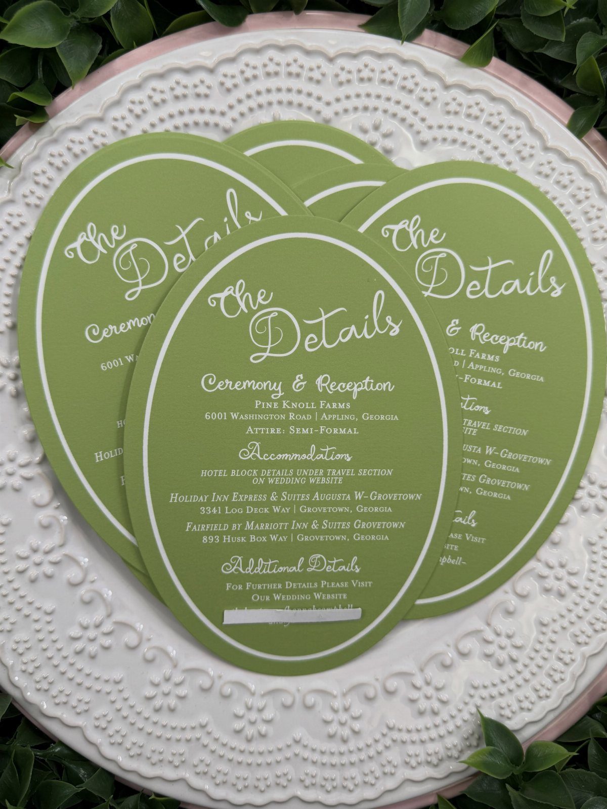
Hotel names, ceremony and reception details all fit on one small card, so the invitation itself stays clean. Listing a few Georgia hotels gives out-of-town guests somewhere to start booking.
Put the hotel names and whether a room block exists, plus any booking deadline, right on the card. Guests plan travel earlier than you might expect, so this card works well when mailed with the save-the-date or invitation.
Two or three options at different price points is plenty, and it keeps anyone from feeling priced out.
7. Save the Dates
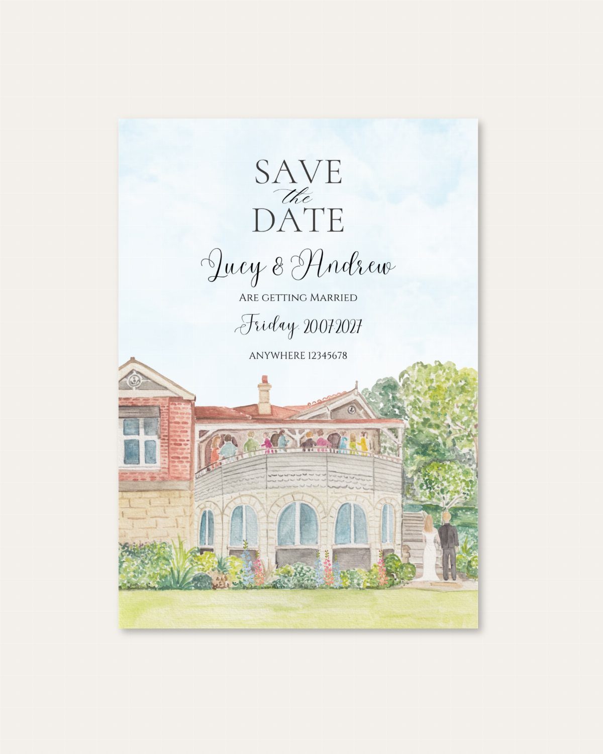
A save the date lands before the invitation, so it only has to carry names, a date and a hint of the look to come.
I would mail these as soon as the date is firm, since guests with travel to plan will thank you. Add your wedding website address to the card, or a short line saying a formal invitation will follow.
Keep the wording short. Everything else can wait for the invitation.
8. Outer Envelope
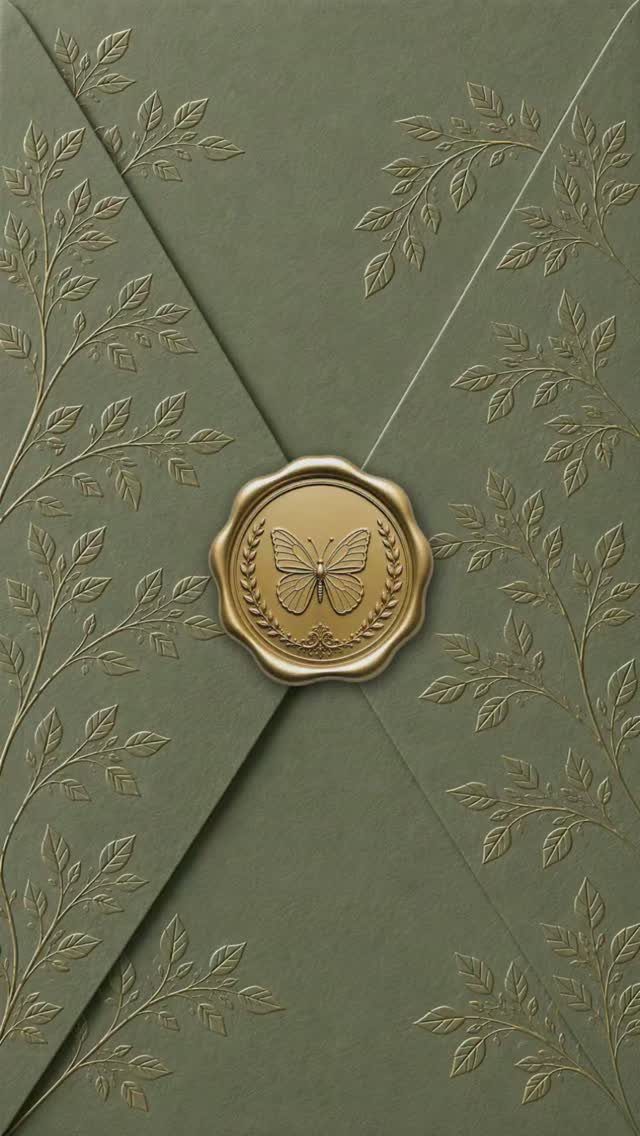
An outer envelope is the first thing a guest touches, so it sets the tone before anything is opened.
Pick the envelope color first and build the inner pieces around it.
Embossing and wax both add cost per piece, so on a tight budget choose one of them. A wax seal is the one flourish worth paying for here, and a plain envelope lets it stand out.
Have your printer send a sealed test envelope through the mail first, then approve the full run.
9. Venue Illustrations

A painted estate with wisteria and a gate gives guests a preview of the place they are traveling to. It also makes the invitation feel like a keepsake instead of a flyer.
Send your illustrator clear photos of the venue and tell them which details to keep, such as the gate or the pond.
Ask whether the artwork can be reused on your save-the-dates, menus and signs. That is where the cost spreads out.
Commissioned art costs more than a template, so ask for a quote early.
10. Sheer Ribbon Bow Wrap
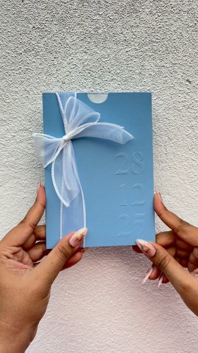
Light blue card, sheer white ribbon, a small bow: this is a cheap way to make a plain invitation feel finished. The embossed date stays visible because the ribbon is thin and see-through.
Sheer ribbon is easy to tie yourself, which saves on assembly fees.
Tie a few test bows first so every one comes out the same size. Tie the knot off-center from the date so the numbers stay readable.
Ribbon can crush in the mail, so slide each piece into an envelope with a little room.
11. Embossed Crest Invitation Card
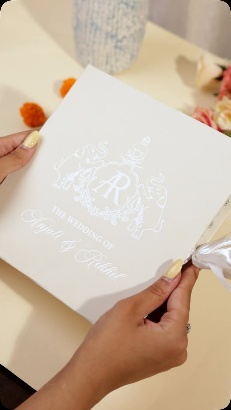
A square white card with a raised crest and monogram puts all its drama in texture. Embossing leaves the card white, so the design shows through light and touch instead of ink.
I would choose this over a printed crest if you want a quiet, formal look.
Check the proof closely, because fine lines in a crest can blur when pressed. Keep the card white and the lettering simple so the crest stays the focus.
Square cards often need extra postage, so ask the post office before you order.
12. Scalloped Paper Accent Matting
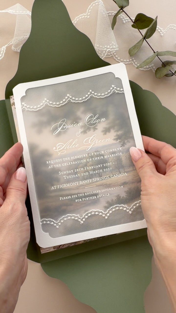
Layering a scripted invitation over a dark green scalloped mat gives a flat card a frame, and the curved edge softens the look.
According to the maker, the suite’s vellum invitation is printed in white ink and finished with natural lace, then sealed with white wax.
I like the mat because it adds depth for the price of one more paper layer. Pick a green dark enough that the script stays easy to read.
Every added layer means more assembly time, so ask your printer to attach them.
13. Mirrored Acrylic Invitation Card
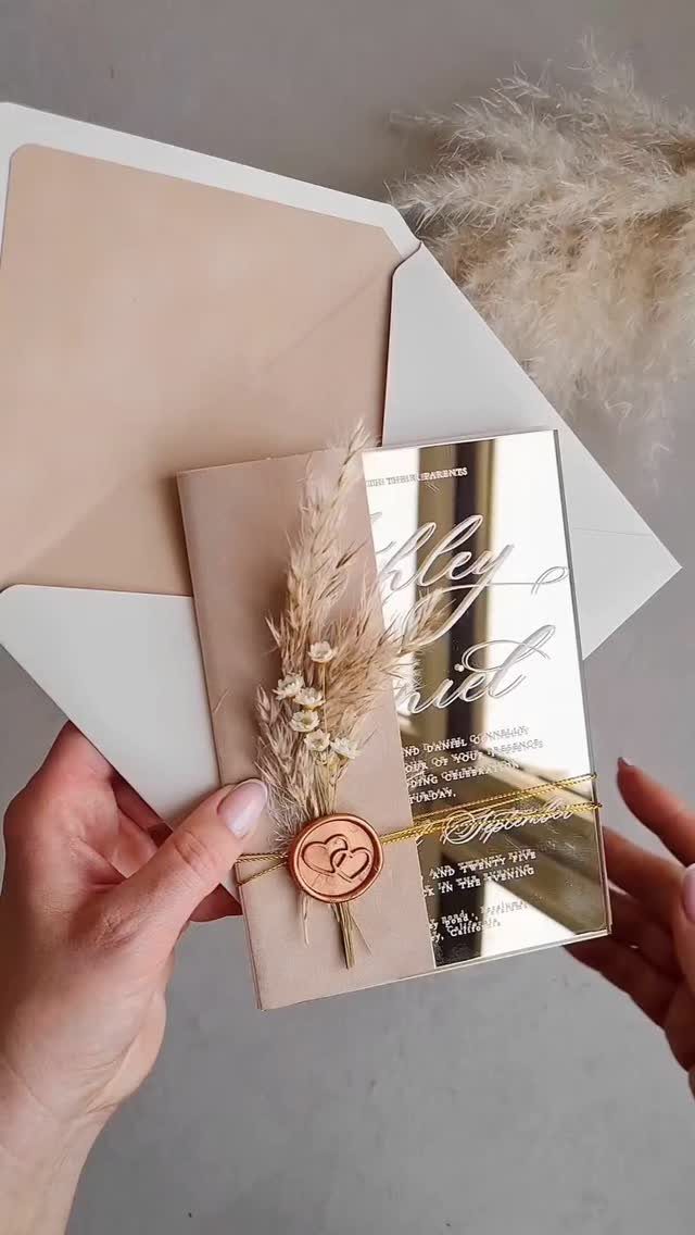
Mirrored acrylic turns the card itself into the decoration, so white calligraphy is all the design it needs. Pair it with a plain beige envelope, and the wax seal and dried florals can handle the softer side.
White ink on a reflective surface can lose contrast, so I would ask for a printed sample and read it under indoor light before approving the run.
Acrylic also costs more than paper, which makes it a good fit for a short guest list or a single hero piece.
14. Vellum Envelope Wrap
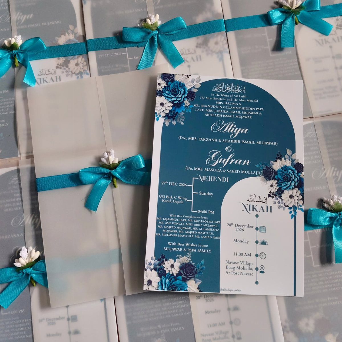
A dark blue floral invitation tied inside a translucent vellum envelope shows off its pattern before anyone touches the ribbon.
Bright blue satin is a bold choice against the dark card, and I like how it reads as a deliberate accent.
Match the ribbon blue to a shade already in the print so the bow looks planned.
Vellum envelopes and ribbon add assembly time, so ask your printer what that costs per set.
15. Wax Seal with Dried Florals
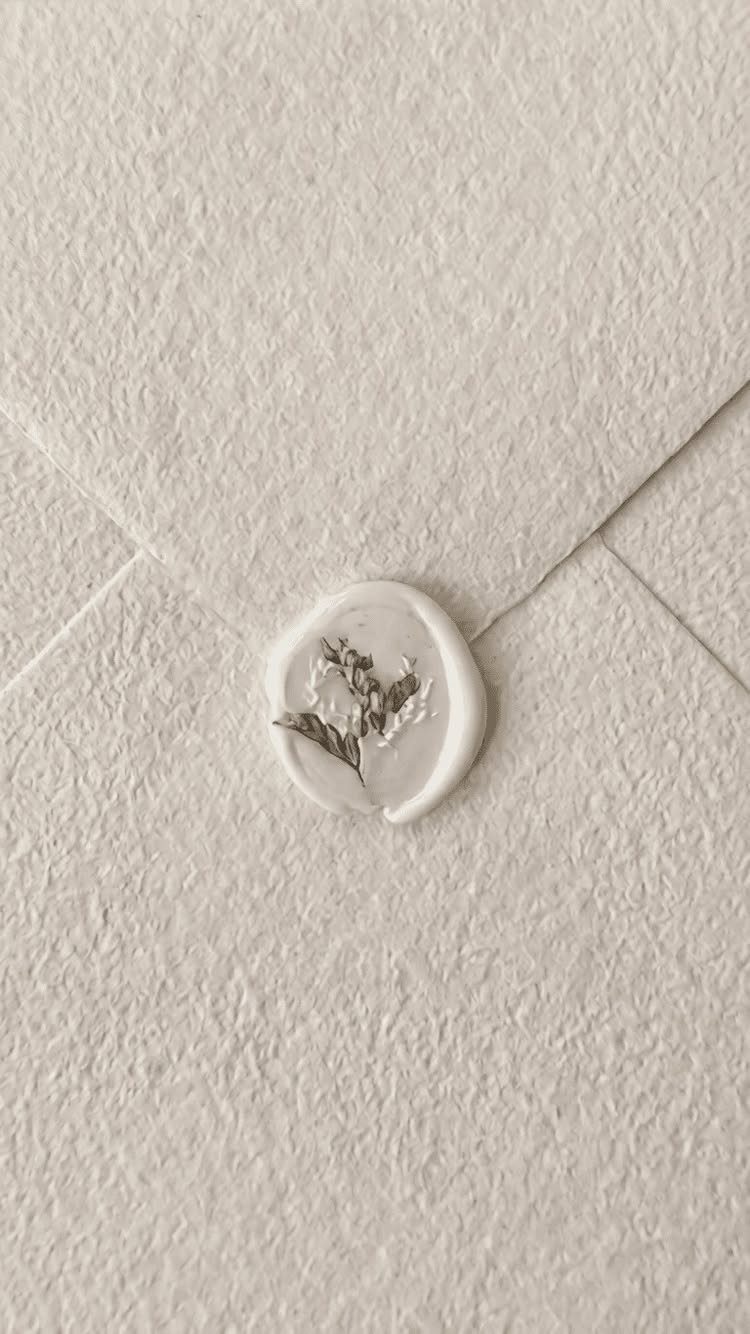
Pressing a small dried sprig into white wax gives a plain cream envelope its one focal point. Textured paper already has character, so I would skip any other embellishment; the seal looks best standing alone.
Choose a sprig that is flat and fully dry, since moisture can cloud the wax. Practice on scrap envelopes until the sprig sits centered and the wax cools evenly.
Hand-sealing takes time, so on a large guest list ask whether your printer offers seals.
16. Deckle Edge Paper Invitation
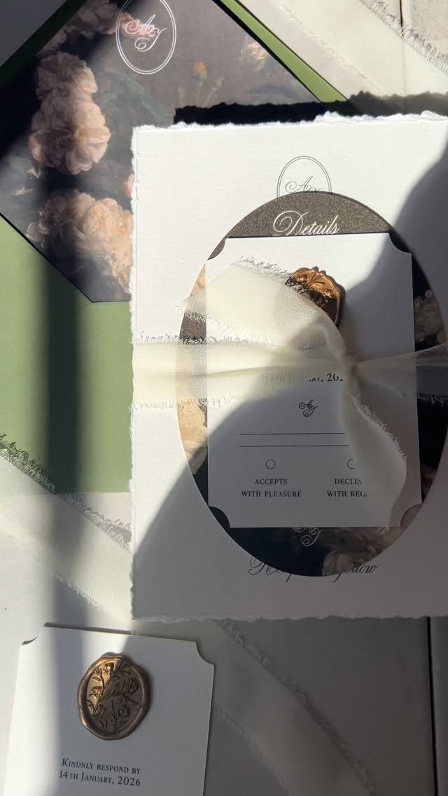
Torn deckle edges make a printed card look handmade, which suits a suite with a floral envelope, white ribbon and a gold wax seal. The soft, uneven border adds charm without more ink.
Keep the wording tidy, since the rough edge already supplies the texture. The reply line, such as "Kindly respond by 14th January, 2026," should sit well inside the border so no letters are lost near the edge.
Ask your printer whether the deckle is real or cut to imitate one, because the price can differ.
Importance of Clarity
Guests rarely count cards. They remember whether they could find the date, the place and the reply deadline in about 10 seconds.
Test that before you print.
Hand the draft to someone who has never heard your plans and ask them to tell you when, where and how to respond. If they hesitate, fix the layout, not the card count.
Put the most important facts in the largest type, and keep one idea per line. A clear two-piece suite beats a five-piece suite where guests have to hunt.
Budget Considerations
Guests never count how many pieces came in the envelope, so a slim suite with just an invitation and an RSVP card costs far less than a stacked one and loses nothing in the eyes of the people opening it.
Inner envelopes, a separate accommodations card and any insert that repeats information already printed elsewhere can all go, and the suite usually looks cleaner for it.
Before you cut anything, list every piece and ask what it tells guests that no other piece does. If the answer is nothing, drop it.
Printing choices follow the same logic.
Many printers will print designs you bring from platforms like Canva, Templett and Etsy, which can cost less than a full custom order. Get quotes for both routes, then decide where your money should go.
Design Personalization
Personal touches work best when they say something true about the two of you.
A shared hobby, a place that matters to you or a color you already love will read as personal. A random trend will not.
Pick one or two elements and repeat them across the suite, so the design feels like yours. Too many ideas in one card make it busy.
Custom work also gives you a keepsake. If a full custom suite is out of reach, a template with your own wording and one custom detail gets you most of the way.
Frequently Asked Questions
What should be included in a wedding invitation suite?
At minimum, an invitation and an RSVP card. A reception card and an accommodations card are common extras, but guests never count pieces, so add one only if it tells them something no other piece does.
When the ceremony and reception share a venue, a separate reception card is just extra paper; put the reception line at the bottom of the main invitation and save the postage weight.
When should I send out save the dates?
Six to eight months out is the window for mailing, and the date only needs to be locked in, not the whole plan. Anyone booking flights or hotel rooms gets a real head start from an early notice.
A save the date has little work to do: names, the date, a nod to your design, and either your website address or a note that the formal invitation is coming.
What is the purpose of a details card?
A details card carries the extra information that would crowd the invitation, such as reception details and dress code.
That keeps the invitation itself clean. Every added card means more printing and postage, so I would skip it when the invitation can hold the same facts.